
LINH MCDERMOTT
Project: Customising Digital Licences and Wallet in the Services Victoria App
As the lead product designer, I am responsible for the end to end delivery of enhancement to the Services Victoria App. This provides a secure and convenient way for citizens to access their digital driver’s licences, fishing licences, and other credentials. However, users currently have limited control over how these licences (or “holdings”) appear within their digital wallet. Newly added holdings are automatically positioned first, leading to confusion and a poor sense of personalisation.
Project goals
This project aimed to enhance the digital wallet experience by allowing users to reorder, favourite, and personalise their licence tiles, while maintaining accessibility, clarity, and seamless integration with the existing design system.
-
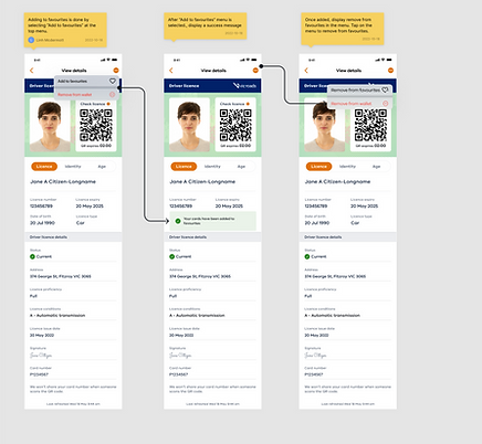
Introduce intuitive reordering and favouriting interactions for licence cards.
-
Maintain a clear distinction between active and inactive cards.
-
Simplify the visual hierarchy while ensuring scalability for future licence types.
-
Align UI patterns and components with the Services Victoria design system for implementation efficiency.
Problem statement
How might we enable users to customise and prioritise their digital licences and wallet holdings, so that their most relevant cards are surfaced intuitively and consistently across sessions?
Process & Deliverables
1. Discovery & Research
-
Landscape Review: Conducted desktop research into wallet and card management UX patterns across leading apps (e.g. Apple Wallet, Google Wallet, Service NSW, MyGovID).
-
Identified best-in-class interactions for drag-and-drop reordering, favourite pinning, and visibility toggles.
-
Captured interaction examples in a comparative audit matrix to inform interaction logic and motion patterns.
2. UX Exploration
-
User Scenarios & Flows: Mapped user journeys for adding, reordering, and removing cards.
-
Considered accessibility needs, touch targets, and logical grouping (active vs inactive cards).
-
Low-fidelity wireframes explored multiple configurations for reorder and favourite states.
-
Internal review sessions held to align with product and development teams on technical feasibility (animation load, data persistence).
3. Mid-Fidelity Wireframes
-
Created mid-fi wireframes in Figma to visualise interaction flows:
-
Drag-and-drop reordering interaction with visual cues.
-
Favourite toggle to “pin” a card to the top.
-
Inactive cards represented with a muted palette and “Activate” CTA.
-
-
Included annotations explaining state changes, logic, and accessibility rules (e.g., keyboard focus order for reordering).
4. UI Design (High-Fidelity Stage)
-
Developed high-fidelity prototypes aligned with Services Victoria Design System (colours, elevation, typography, component spacing).
-
Designed transition animations (micro-interactions for drag and reorder) to reinforce user control and clarity.
-
Built responsive variants for small and large devices ensuring consistent hierarchy across viewports.
-
Documented design tokens (spacing, typography, and colour variables) to streamline implementation.
5. Developer Handover
-
Structured Figma handover file:
-
Layer naming aligned with component conventions.
-
Embedded redline specs and interaction notes for each screen.
-
Provided motion specs (Lottie references) for reorder and state transitions.
-
-
Collaborated with developers in Agile sprint ceremonies for clarification, QA, and UAT testing.
-
Recorded a walkthrough video in Figma to demonstrate interaction logic and component behaviour.
6. Outcomes & Learnings
-
Improved user autonomy and perceived control over wallet organisation.
-
Design files reduced handover friction by providing developer-ready documentation.
-
Identified future opportunities for expanding personalisation (e.g., colour tagging or grouping by category).
Key Tools
Figma · FigJam · Zeplin (handover) · Miro · Services Vic Design System · WCAG Accessibility Guidelines
UI Focus Summary
The final UI emphasised:
-
Clarity – clean card hierarchy with visible affordances for movement and state.
-
Consistency – system-compliant components for smooth implementation.
-
Control – empowering users with personalisation while maintaining simplicity.


.png)

Low fidelity designs
Early-stage wireframes were developed to visualise and test interaction flows for adding and rearranging digital licences in the Service Victoria wallet, focusing on simplicity and user control.

